A gin that portrays balance
and harmony.
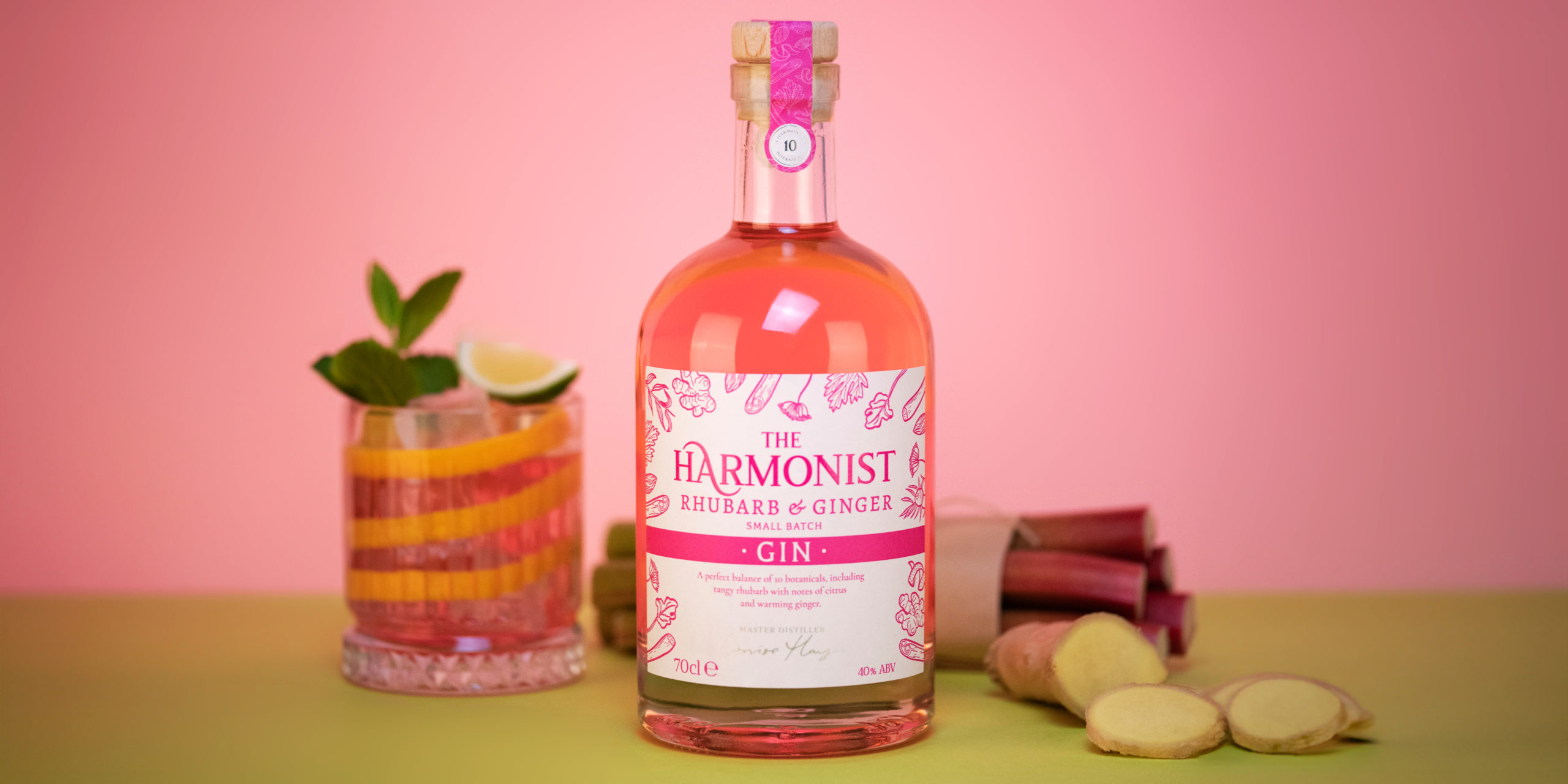
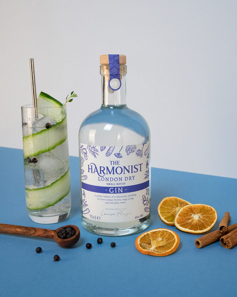
SPAR’s current designs were out of touch with the current market and not what their customers expected from a premium gin. So we were tasked with evolving the designs for their original, and rhubarb and ginger gins, creating a brand ‘family’ that future gin flavours could be introduced to, along with incorporating a new brand name: ‘The Harmonist’.
Working closely with the client we created a range of design variations, incorporating key points from the client, such as the bottle shape, liquid colours and botanical features.
The full design process included a ‘live amends’ session, during which we worked up amends and suggestions whilst talking ‘live’ to the client. This ensured feedback was acted on immediately, which helped the client visualise various design options during the online meeting.
The finished designs feature hand-drawn botanical illustrations depicting the flavours and ingredients used to create the gins, and typography featuring a unique letter ‘A’ that portrays balance and harmony, cleverly bringing together the brand name with a gentle nod to the balance of flavours within.
“I was really impressed with their ability to understand our customer and brand,
and the collaborative way they worked with us to see this project to fruition.
We’re excited to introduce these to SPAR stores around the country
over the coming weeks, and feel confident our customers
will love them as much as we do.”
Adam Georgiou | Brand Manager at SPAR (UK) Ltd